
Zapata Exploration Ltd. is a digital based service brand. It is an exploration company focused on the discovery, acquisition, and development of district scale mineral deposits in Mexico. The clients built this company in 2020 with a portfolio of 11 properties that needed to be sold. They needed a face that matched the companies name, and a platform to market their projects.
Skills and programs | adobe Illustrator, photoshop, color theory, logo design, JavaScript, branding, digital file organization, collaboration
Investigation
Emiliano Zapata was a 19th century Mexican revolutionary whose popularity originated from his advocacy for the common peasant.
His name, face, mustache, and sombrero are famous in Mexican culture, and have been appropriated by several different companies. The clients were set on the company name 'Zapata Exploration Ltd.' , and wanted a logo that identified their company while paying tribute to Emiliano.
Objective
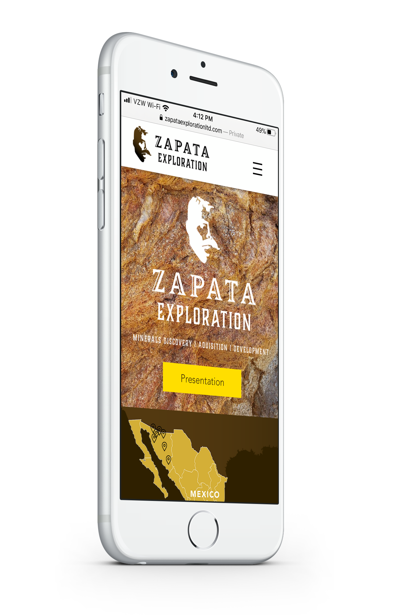
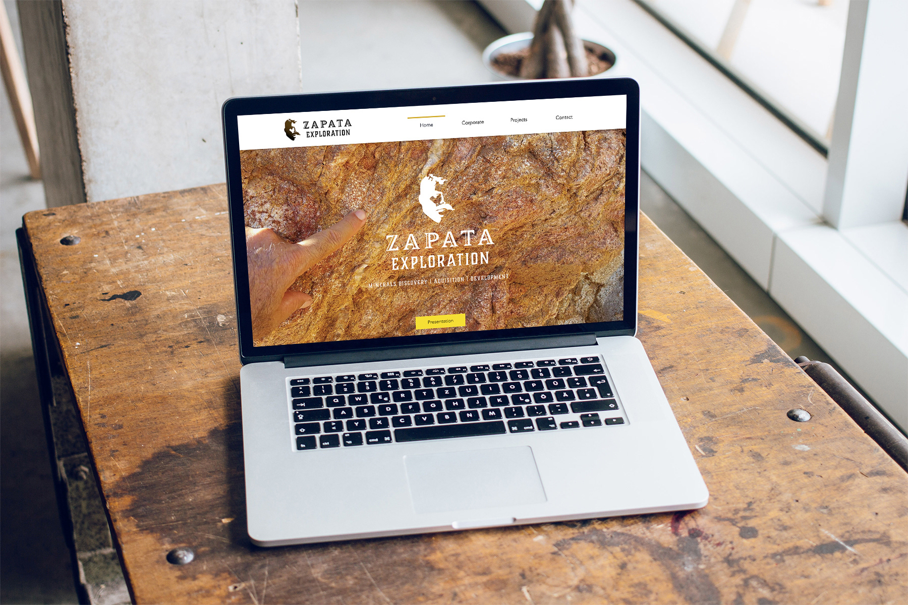
Build a user friendly platform to showcase properties for sale
Target Audience
Mining corporations and third party vendors who need to understand the risks and potential of each property
Interaction Goal
Lead site visitors through a seamless presentation of the company, its owners, and its properties using animated buttons, photographs, and Javascript map interactivity
Parameters
The clients needed a 'Coming Soon' landing page while the website was under construction so they build anticipation for potential buyers and provide contact information. Ideally the project would be completed in 6 weeks and consist of:
1. Unique and Identifiable company logo
2. Redesigned Powerpoint presentation on brand
3. Designed website with SEO and a company email account
4. GIS map alterations and custom map design for each property
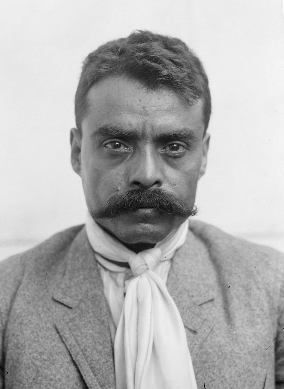
Emiliano Zapata
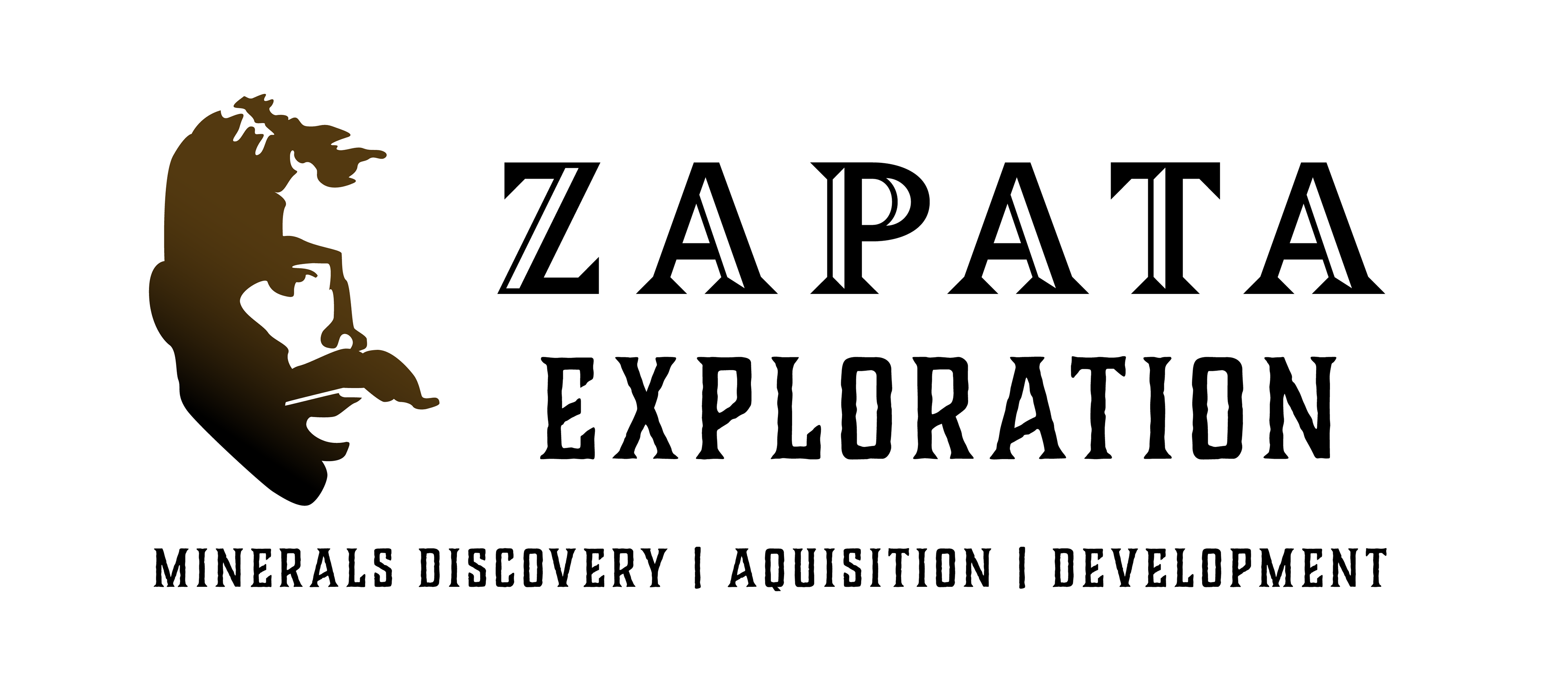
Designing Brand Identity
Zapata Exploration Ltd. official logo
incorporates a silhouette emblem of Zapata's face with stylized and textured typography for a combination of traditional Mexican aesthetic with contemporary use of formatting and color gradation
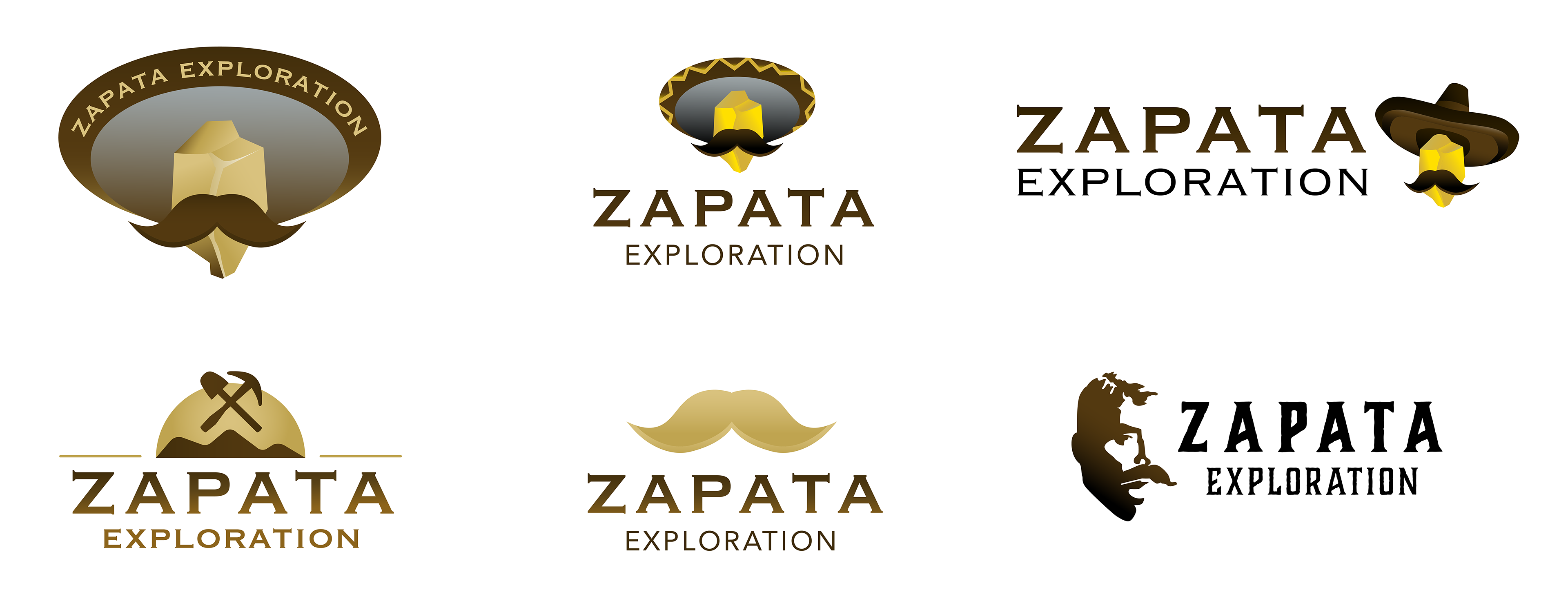
Logo iterations
exploring typographic treatment, pictorial marks, color, and format
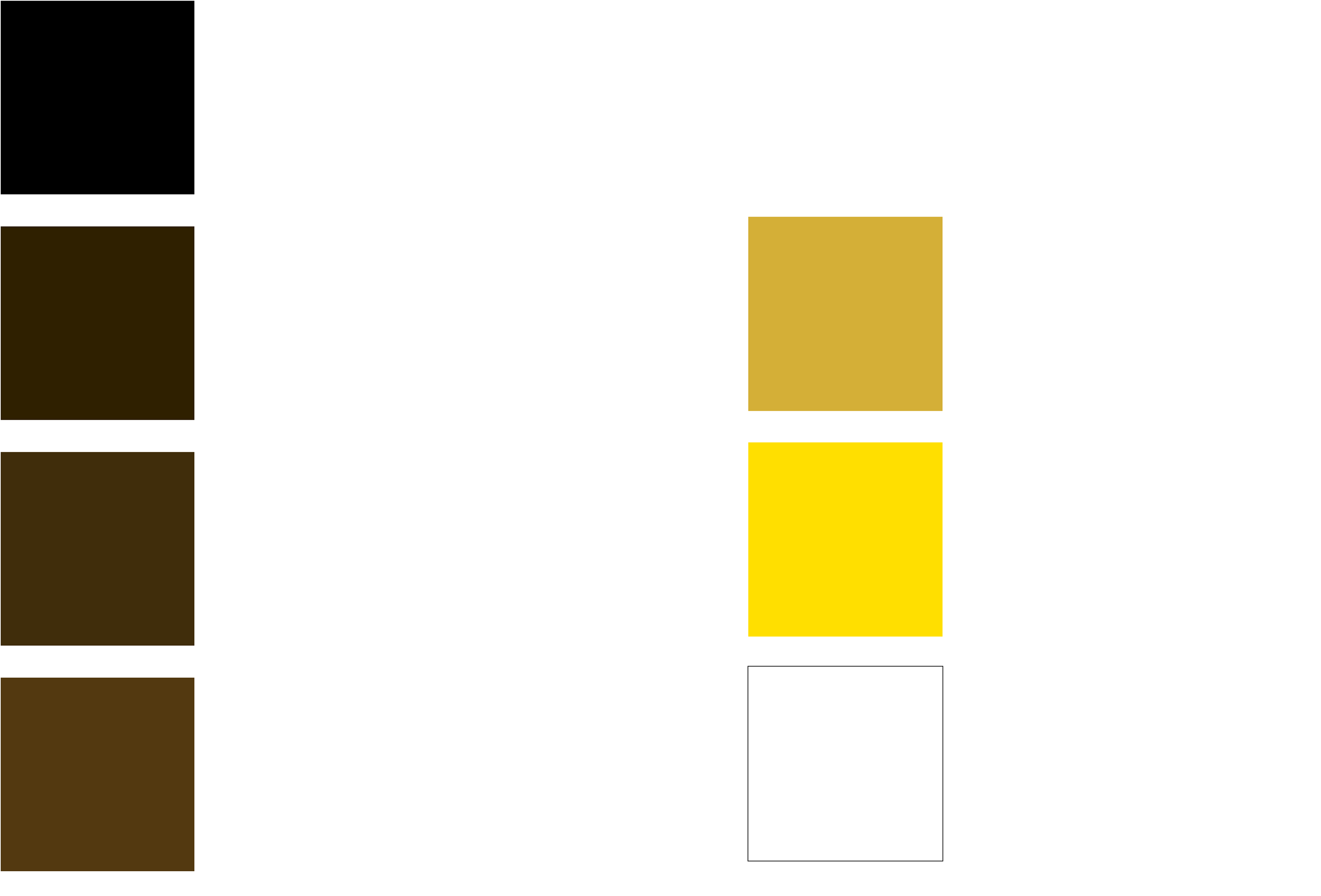
Color palette
earthy brown tones are the basis of the color palette with gold colors used to prime the website user into reading headings, clicking buttons, and providing site navigation
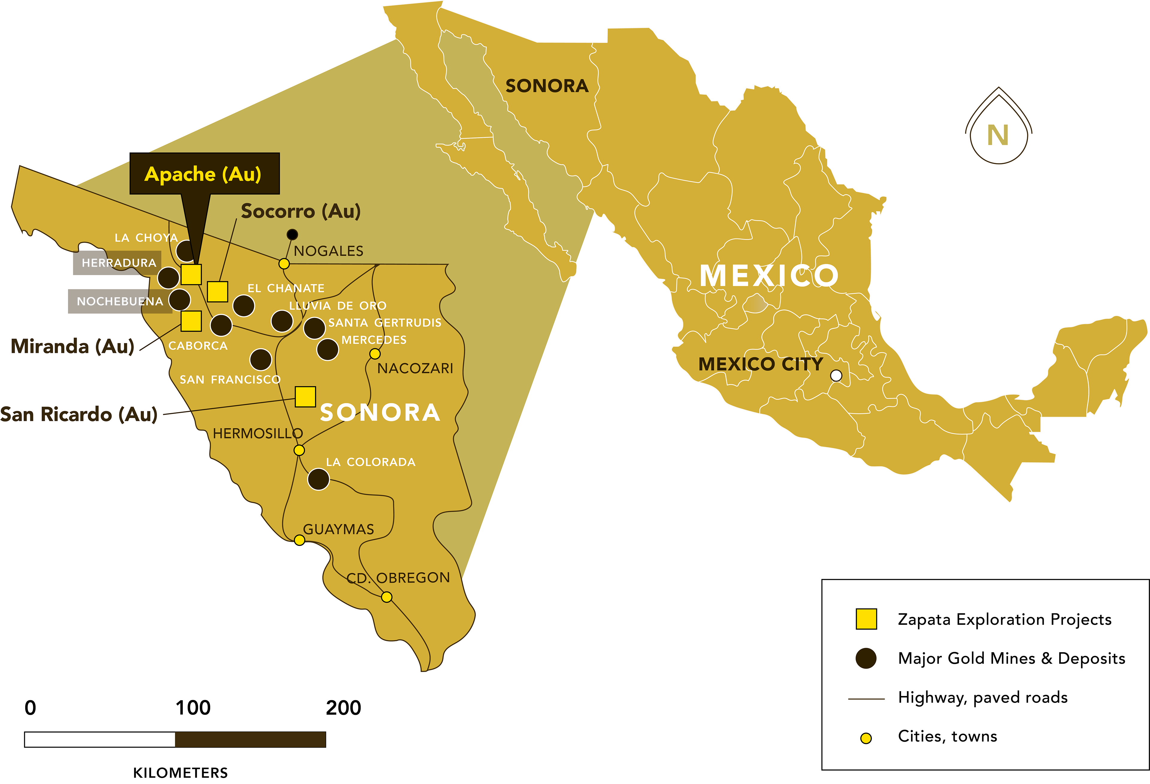
custom map for each property using the new visual brand identity
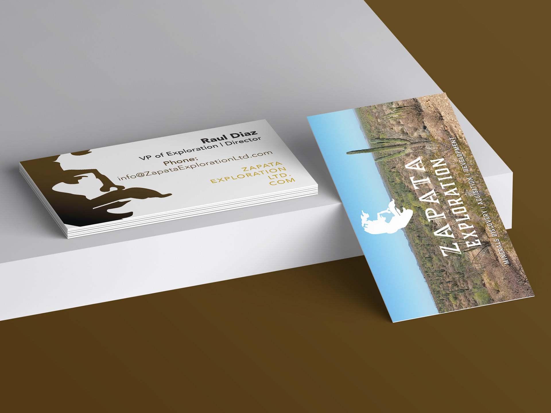
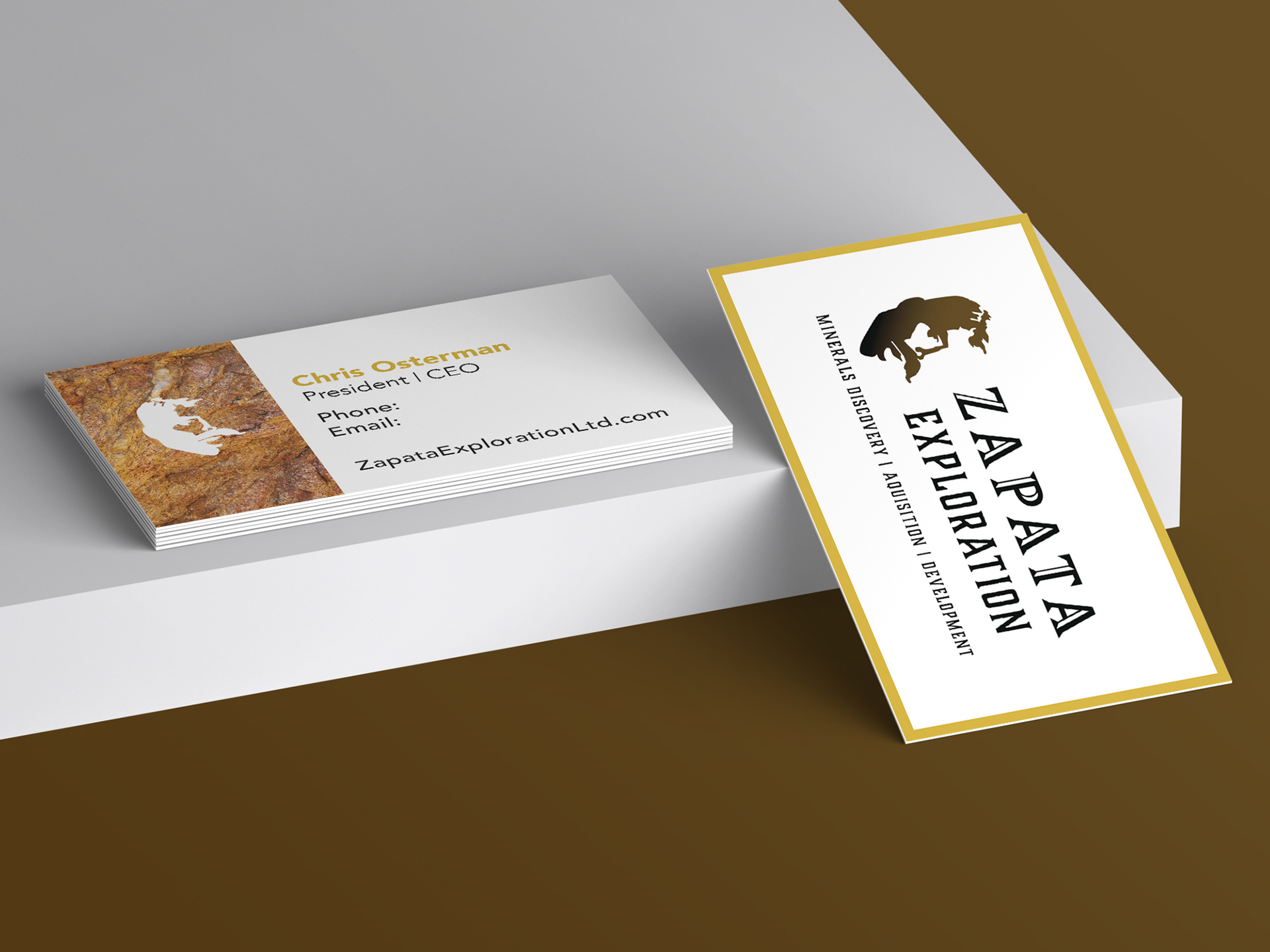
two versions of company business cards presented to the client, who chose the first option as the final design with minor adjustments